As Principal User Experience Designer at Informatica designing a new product, I worked with a UX Researcher to interview and observe several users as they walked us through their data operations workflow.
One key insight we uncovered is that a team of typically 5 or fewer developers and 1 manager have multiple data jobs in development and production. After design and deployment of the data jobs, the same team is also responsible for monitoring the data flow on a day-to-day basis.
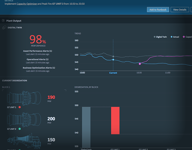
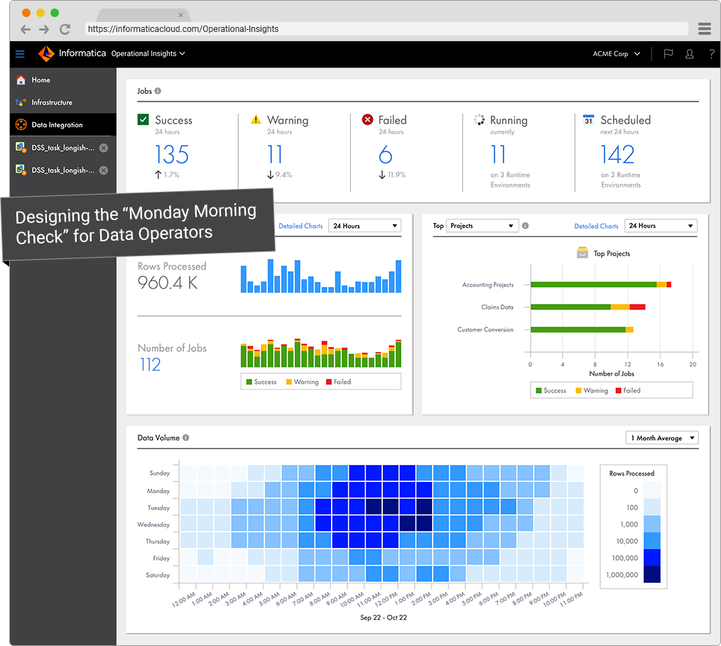
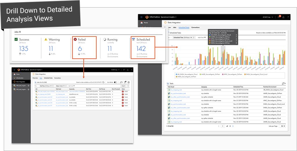
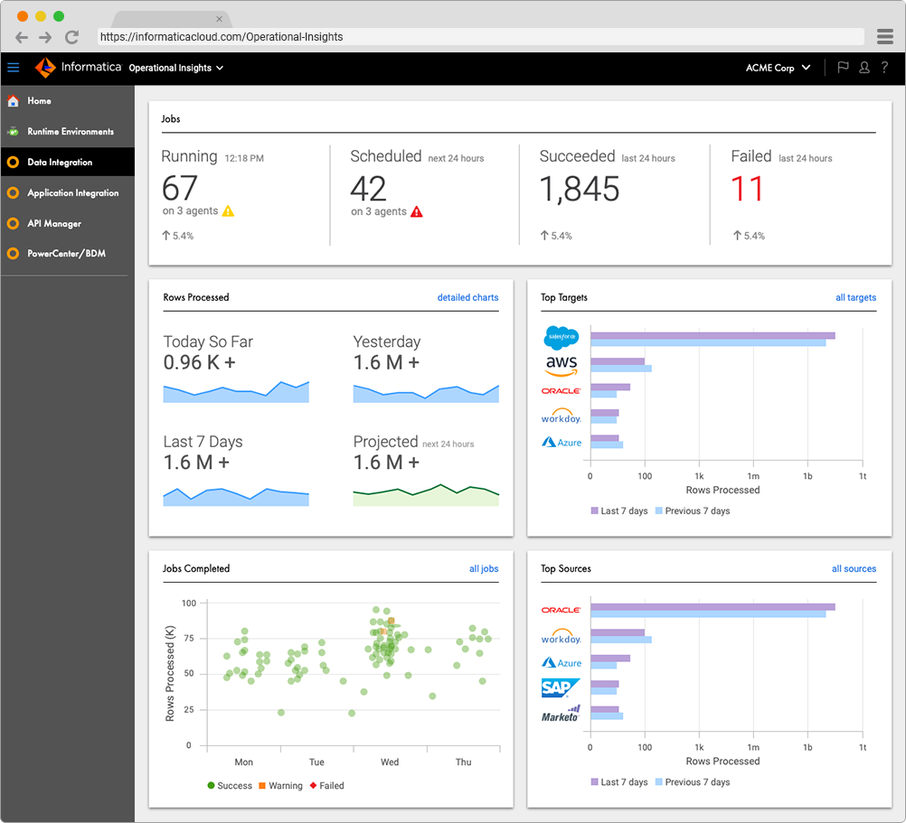
The overview dashboard gives the data integration team a quick overview of their operations, or what I called the Monday morning check of data integration jobs.
Big Numbers, 1st Glance
Another key insight I discovered by observing users is they want their first glance to contain large actionable numbers, or “fast facts”, rather than common visualizations such as pie charts and donut charts.
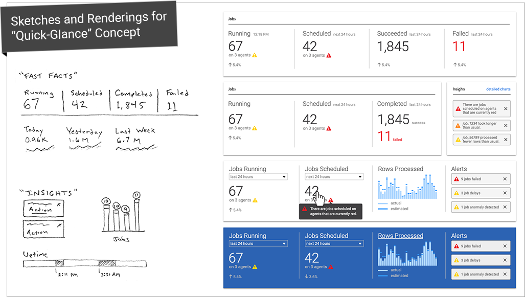
Analysis Views, 2nd Glance
Visualizations are the second glance for a more detailed analysis of the data.
Developer Research
After the initial launch of the application, I spoke with customers to understand their impressions and if the design was meeting their needs. The best reaction after the product launch was this.

“The right kinds of metrics”
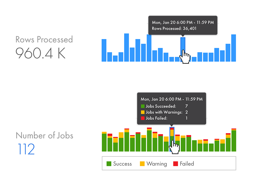
Rows Processed and Number of Jobs are the two key metrics. Shown above are miniature visualizations of the data to be used on the overview dashboard. Hovering over the columns provide additional information. The Number of Jobs chart is a stacked column chart because it displays an additional dimension of data by breaking down the count by job status.
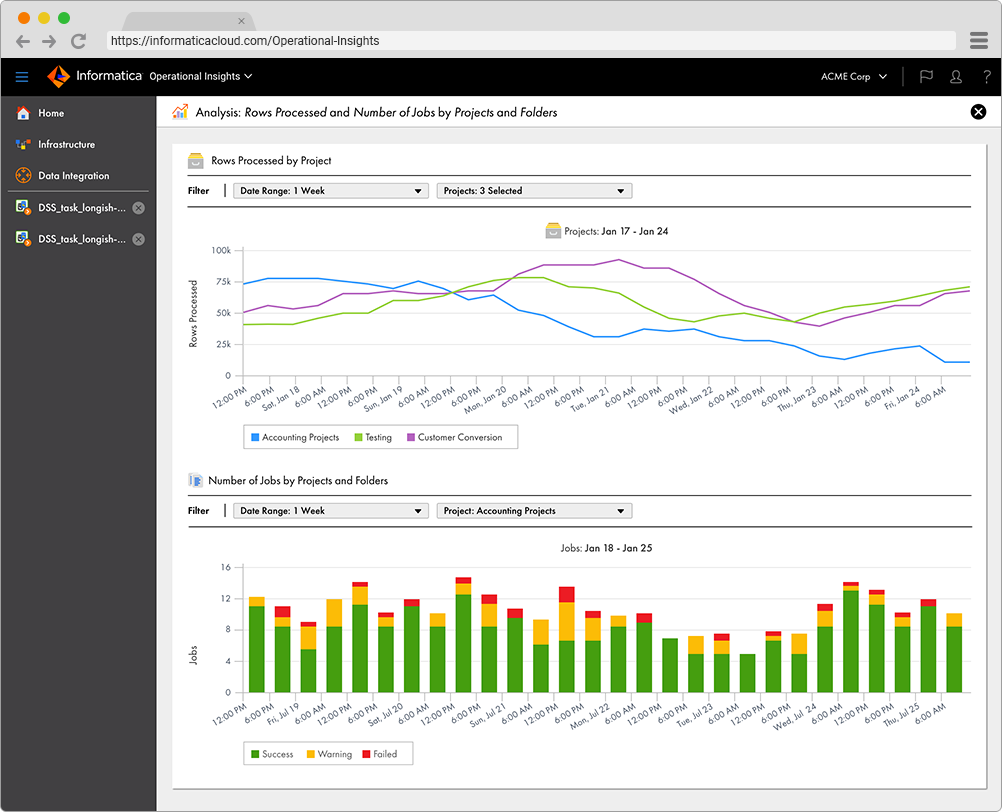
Each of the key metrics can be correlated with supporting attributes such as Projects or Folders. The line charts above let users visualize and compare the data over time.
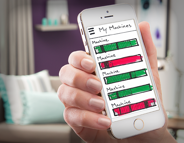
Customer Observation
While interviewing customers, I observed a variety of solutions that developers pieced together to support their workflows.

This contextual observation generated numerous ideas for data visualization and reporting features, and also inspired new product strategies such as a Slack app for monitoring operations.
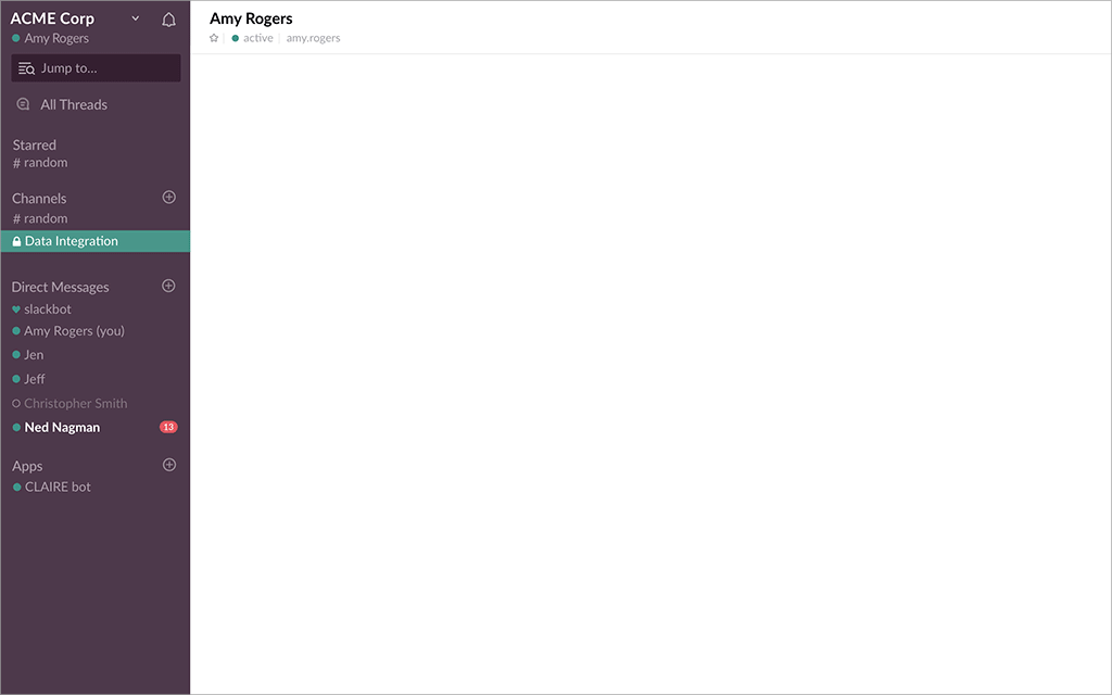
Utilizing Slack gives teams an impactful way to view their operations data in a collaborative tool that they use daily anyway.
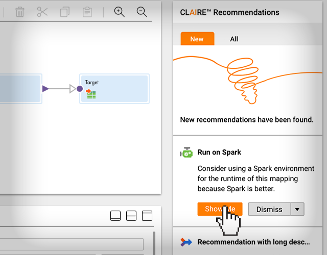
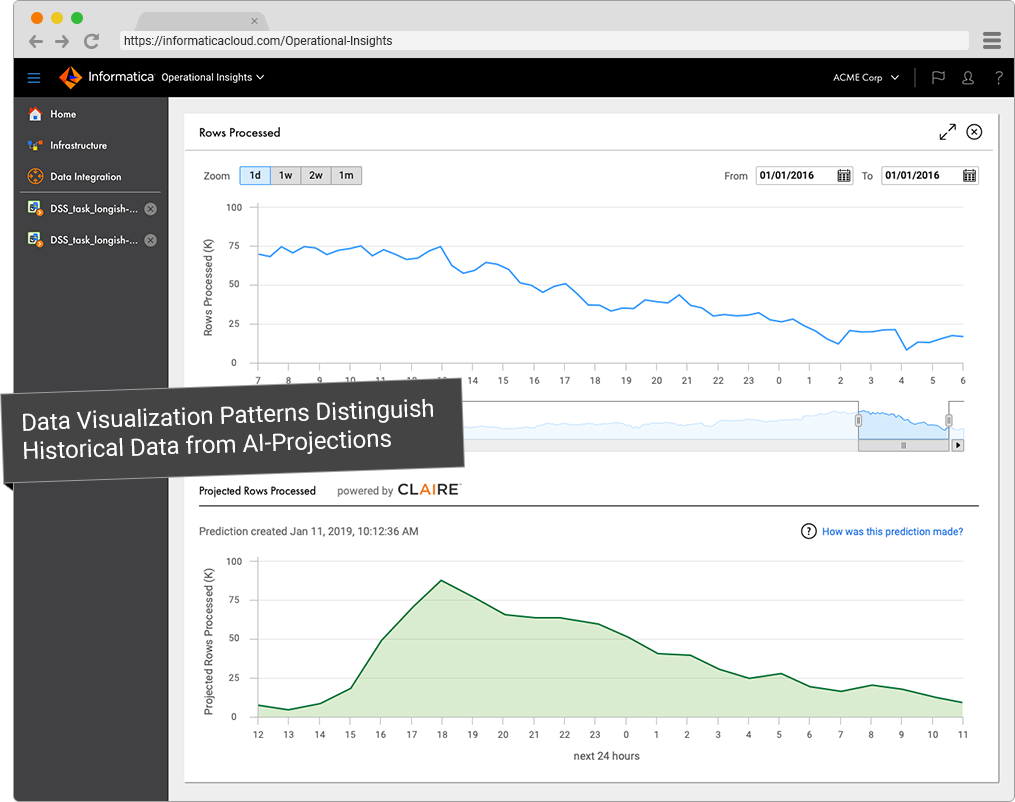
AI Predictions
I established a color scheme to distinguish actual values from predicted values, using blue for actual and green for predictions.
Earlier mockups use company logos in the y-axis labels for the grouped bar charts. This was a popular idea with product marketers. However, the design proposition wasn’t scalable considering Informatica supports several hundreds of connector types, and custom connections wouldn’t come with an associated logo image.