As Senior Staff UX Interaction Designer at GE Digital, I designed a dashboard application that gathers and stores data points from industrial sensors, and then displays statistical calculations so that customers can get the most performance out of their 3D laser printers in additive manufacturing facilities.
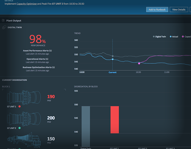
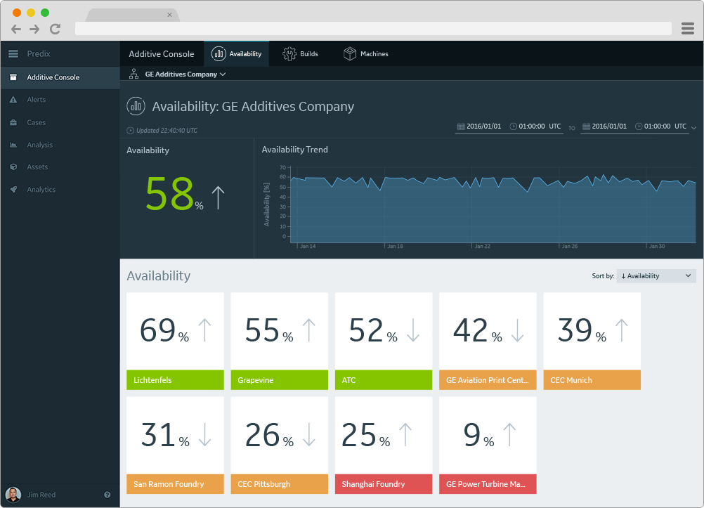
Customers want high visibility into their machines and the dashboard app provides it. The key dashboard metric for each manufacturing facility is an Availability Score, which is a calculation of the printing productivity of each additive printer and aggregate score.
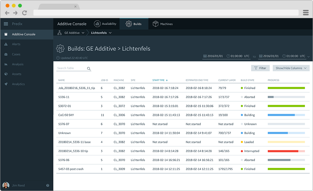
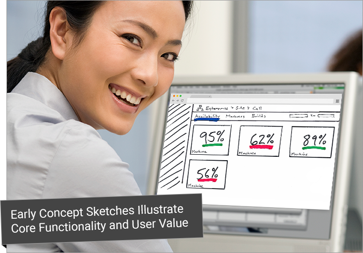
Additional key information to display is the individual printing progress of each printer at a manufacturing plant. For example, the Lichtenfels plant as shown in the mockup above.
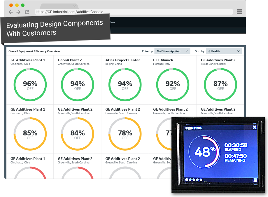
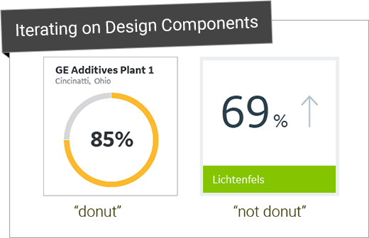
Initial mockups included an Availability Score visualized with a circular donut chart. However, while concept testing with stakeholders and end users, I quickly realized that donut charts are typically used as progress bars on 3D printers to indicate printing progress (see inset above). Using the same visualization for another metric (Availability Score) created confusion, so I changed the visualization to be a simple number and color indicator:
User Research
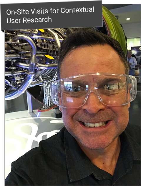
I had the fortunate opportunity to conduct early contextual user research and visit an additive manufacturing facility where aircraft engines parts are made using advanced 3D printing technologies. I couldn’t resist the photo-op, a selfie with a giant aircraft engine in the background.
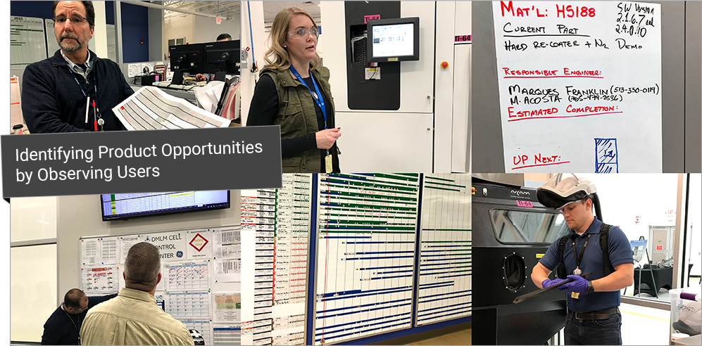
I got to witness the manufacturing process, and most importantly talk to real users in their contextual environments. This gave me first-hand anecdotal data that helped me identify product opportunities.
Product Strategy
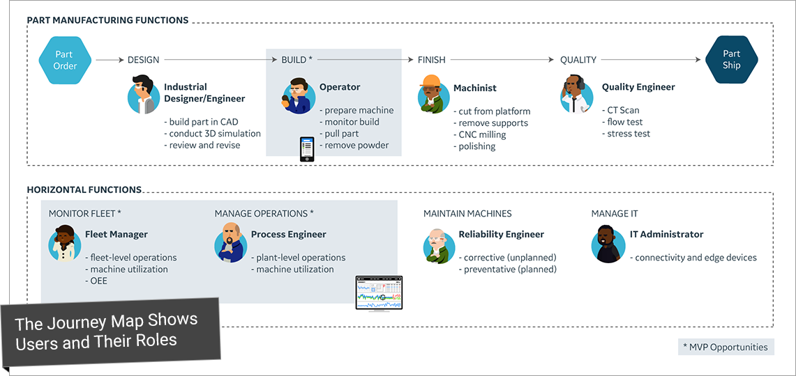
I mapped out roles and user tasks with a simple journey map which was a powerful tool to help identify product opportunities and key personas.
Personas
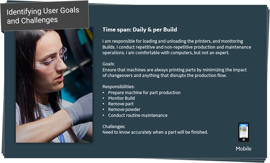
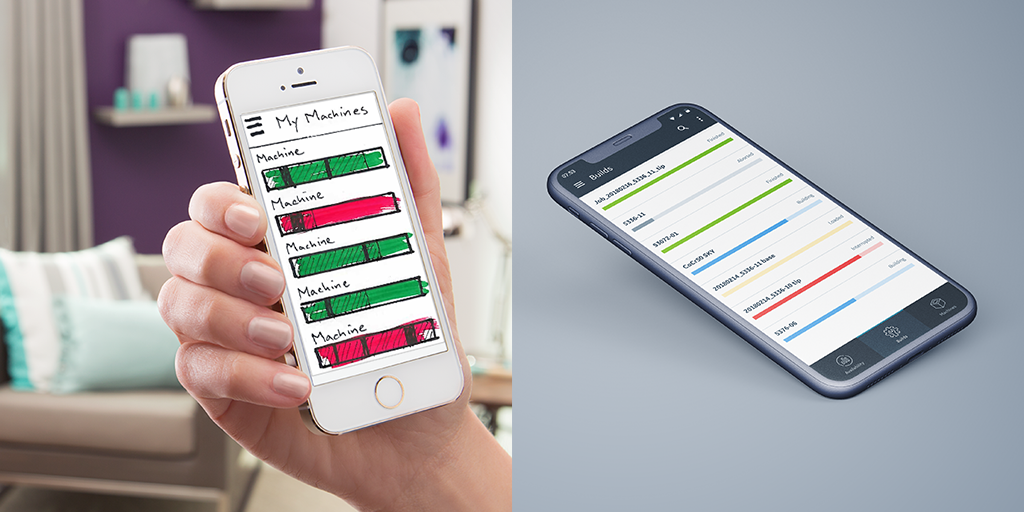
Mobile
One key insight that I gathered during the site visit is that Operators are often “on call”, so they want to monitor printer status remotely. This insight led to a few mobile design concepts.